1
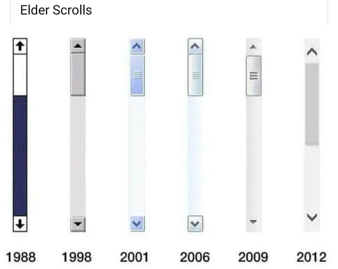
Elder scrolls
(slrpnk.net)
In b4 someone tells me 6 isn't out yet
I'm not a huge fan of the flat button aesthetic. Give me the 3D-esque buttons and the translucent Aero window frames of Windows Vista.
Our GPUs, even the integrated ones, are powerful enough for it now.
I am scared of the Plasma 6 upgrade. I currently have oxygen theme with a bunch of stuff like lamp minimizing effect, fall apart effect when closing windows, wobbly windows when moving or resizing them, animated rainbow mouse pointer (XP style). Also the loading mouse icon when opening programs is the programs icon jumping up and down.
I am not sure all of it will work on Plasma 6.
I can verify that lamp minimizing, and wobbly windows work on plasma 6 (Arch btw). The only things that stopped working for me were a couple widgets that I found out haven't been updated in like 8 years.
2006 was the peak
Combining 2006 and 2009 would be ideal. High contrast etc.
I actually prefer 1988, the haven't managed to improve it at all
It worked well in 1988, but in a world of dark mode UIs you can’t tell which is the highlighted area without contour shading.
I yearn to return to 1998.
Just install linux and change your gtk/qt theme. It's that easy.
It does suck that Linux copies the same terrible themes from Windows and that the older more accessible themes are becoming incompatible with modern Linux distros.
I just want a Linux that looks like a computer from 1998. Be it Windows, Mac OS X or native Linux.
It's easily the best option on this image. Nothing else even comes close in terms of visual clarity and simple aesthetics.
The elder scrolls, online
Simplifying the most recent scroll bar feels like a huge step backwards to me. It really is the epitome of modern tech needlessly boiling down to its basic visual aspects to emulate a "clean" environment for the users.
Give me back my scroll bar texture damnit
UIs get worse all the time, very frustrating. Who needs contrast, right? I have good eyes and know exactly where to look. My mother? Holy shit no chance.
Not necessarily for visibility but when i work I NEED FUCKING BORDERS FOR MY FUCKING BRAIN TO KEEP FUCKING STRUCTURE AND NOT EVERYTHING FADING OUT INTO ..yeah thanks i lost the thread again
Seriously fuck Wikipedia's desktop redesign, I regret that I donated before the change
In case you weren't aware, there are extensions that you can use to restore the older (better) UIs. Here are a couple:
There are probably some for other browsers as well. I don't use them though. I instead wrote myself a tampermonkey script to change it:
if (!window.location.search.contains('useskin')) {
  var new_url = window.location.protocol
      + "//" + window.location.hostname
      + window.location.pathname;
  if (window.location.search == "") {
    new_url = new_url + "?useskin=monobook";
  } else {
    new_url = new_url + window.location.search + "&useskin=monobook";
  }
  new_url = new_url + window.location.hash;
  window.location.replace(new_url);
}
You can compare the available wikipedia styles on this page to see which one you like best: https://en.wikipedia.org/wiki/Wikipedia:Skin?useskin=monobook
Yeah, and I do that, I just don't think I should have to. I should be able to open the website on a fresh install and not get nauseous using it.
At least on the bright side, people are becoming much more aware of accessibility. I'd argue that old sites were accessible mainly on accident due to most being restricted to fairly straightforward CSS and HTML. The advent of Javascript was a dark time...
I don't think it was a pure accident as some non-accessible designs would still be possible with those limitations. IIRC scroll bars were taken from the OS back then, so if the OS didn't have accessible design, it wouldn't be a thing for the websites either.
It's really depressing how often I have to turn off CSS entirely just to view a webpage. I could of course always go into the inspector and turn off the bad CSS, but Gecko-based browsers fortunately have "View -> Page Style -> No Style" which is must easier and faster.
And seriously, whoever invented the font-weight CSS property can burn in hell. Ditto for whoever decided that we should only be allowed to read light grey text on slightly lighter grey background.
Browsers have an accessibility check for contrast for this reason. More devs / designers should use it.
This. Holy shit is it frustrating to click a pixel wide scroll bar that is on the edge between two monitors. It's even worse when they disappear.
Not just scrollbars. Buttons, input fields, etc.
Dammit I sometimes have to search for elements I can interact with. Back in the day it was self explaining.
I recently had a complaint with a website:
"Users are having trouble scrolling!"
My response:
"Are they using the scroll wheel/directly scrolling with the touchpad, or using the scroll bar?"
They were, of course, using the scroll bar. I am now somehow responsible for design choices made at the level of the browser, because browsers have decided that the scroll bar should be nigh impossible to use. Yippee.
What really chuffs my spuds is when the application decides they want to provide their own UI rather than using the system default.
Its the epitome of technology that as it improves some things become obsolete.
Pretty much every mouse has a scroll wheel on them now. I very seldom click on a scroll bar now. So the design has changed with that consideration in mind.
It's a design choice, not a question of obsolescence. If it were, we'd be talking about their decision on removing the scroll bar, not changing it.
At the very least the style change could have been optional.
In 2012, Tiber Septim achieved Chim and erased the scrollbar textures.
I remember Windows XP coming out and we all mocked it as Windows but with an interface by Crayola. But I'd gladly have that Crayola interface back rather than the flat modern crap we have now.
What will be released first? Elder Scroll 6 vs new Windows scroll bar?
And now I'm blind. Thanks!
You should've known better, the moth priests have to train for years to use these
I like 1998 the most. Easy on the eyes and doesn't distract from the content that would appear on the side, but has enough pop to indicate that it can be interacted with.
For me it's the XP scrollbars that do it for me, cause I was sick and tired of the BSoDs I got during the Win9x era (especially in WinMe). I couldn't wait to get a PC with the newer OS as a teen. It was considerably more stable for me (especially after SP2).
I reckon SP2 was peak Windows. At the time, even as Windows 7 came about, IT people would always say how rock solid XP SP2 was, excellent driver support, ran everything you wanted at the time and rarely had issues.
I feel especially as a teen, I was so enamored with the allure of the Aero theme which was in Vista and eventually 7 that I was quick to dismiss XP.
Hind sight is 20/20, now I just run Linux because Windows is not what it used to be, now its a bloated monster.
I used all of them, I'm feeling old now.
Did anyone ever rock Windows Longhorn when they were developing vista?
Yep, I sure did. For quite a while too, as I recall. I think I was too scared to move to it permanently and dual-booted with WinXP. First time I saw the status bar of a copy or install processing and seeing it do the …rolling colors in the filled in portion I thought something was wrong. I was used to a static status bar where it just filled in and didn’t do anything fancy.
Anyone else hate the trend of removing arrow buttons?
I hated the trend of flat buttons. Then they removed the buttons. Then they basically removed the entire scrollbar altogether.
At this point, I'd happily go back to the age of flat buttons. That's how bad things have gotten....
I am not a fan of the general trend of de-buttoning.
Like... isn't the entire point to make things consistent and intuitive? Make a clickable button visually distinct!
What I hate is how in Firefox in Linux I only have these tiny "slim" scrollbars that hide when not in use.
2024, scrollbars? What scrollbars? We decided that you don't need them. Sorry but your adblocker and script blocking, broke our own shitty implementation of scrolling. Please enable all scripts for our large ad family to feast on your data.
I really hate sites that change scrolling It always looks weird and uncomfortable. Who thinks this is a good idea?
2001-2006 the golden age of scrollbars.
Welcome to Lemmy Shitpost. Here you can shitpost to your hearts content.
Anything and everything goes. Memes, Jokes, Vents and Banter. Though we still have to comply with lemmy.world instance rules. So behave!
1. Be Respectful
Refrain from using harmful language pertaining to a protected characteristic: e.g. race, gender, sexuality, disability or religion.
Refrain from being argumentative when responding or commenting to posts/replies. Personal attacks are not welcome here.
...
2. No Illegal Content
Content that violates the law. Any post/comment found to be in breach of common law will be removed and given to the authorities if required.
That means:
-No promoting violence/threats against any individuals
-No CSA content or Revenge Porn
-No sharing private/personal information (Doxxing)
...
3. No Spam
Posting the same post, no matter the intent is against the rules.
-If you have posted content, please refrain from re-posting said content within this community.
-Do not spam posts with intent to harass, annoy, bully, advertise, scam or harm this community.
-No posting Scams/Advertisements/Phishing Links/IP Grabbers
-No Bots, Bots will be banned from the community.
...
4. No Porn/Explicit
Content
-Do not post explicit content. Lemmy.World is not the instance for NSFW content.
-Do not post Gore or Shock Content.
...
5. No Enciting Harassment,
Brigading, Doxxing or Witch Hunts
-Do not Brigade other Communities
-No calls to action against other communities/users within Lemmy or outside of Lemmy.
-No Witch Hunts against users/communities.
-No content that harasses members within or outside of the community.
...
6. NSFW should be behind NSFW tags.
-Content that is NSFW should be behind NSFW tags.
-Content that might be distressing should be kept behind NSFW tags.
...
If you see content that is a breach of the rules, please flag and report the comment and a moderator will take action where they can.
Also check out:
Partnered Communities:
1.Memes
10.LinuxMemes (Linux themed memes)
Reach out to
All communities included on the sidebar are to be made in compliance with the instance rules. Striker