269
How paint can change a room
(lemmy.world)
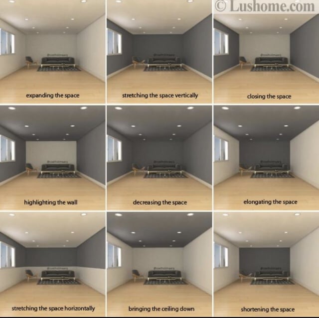
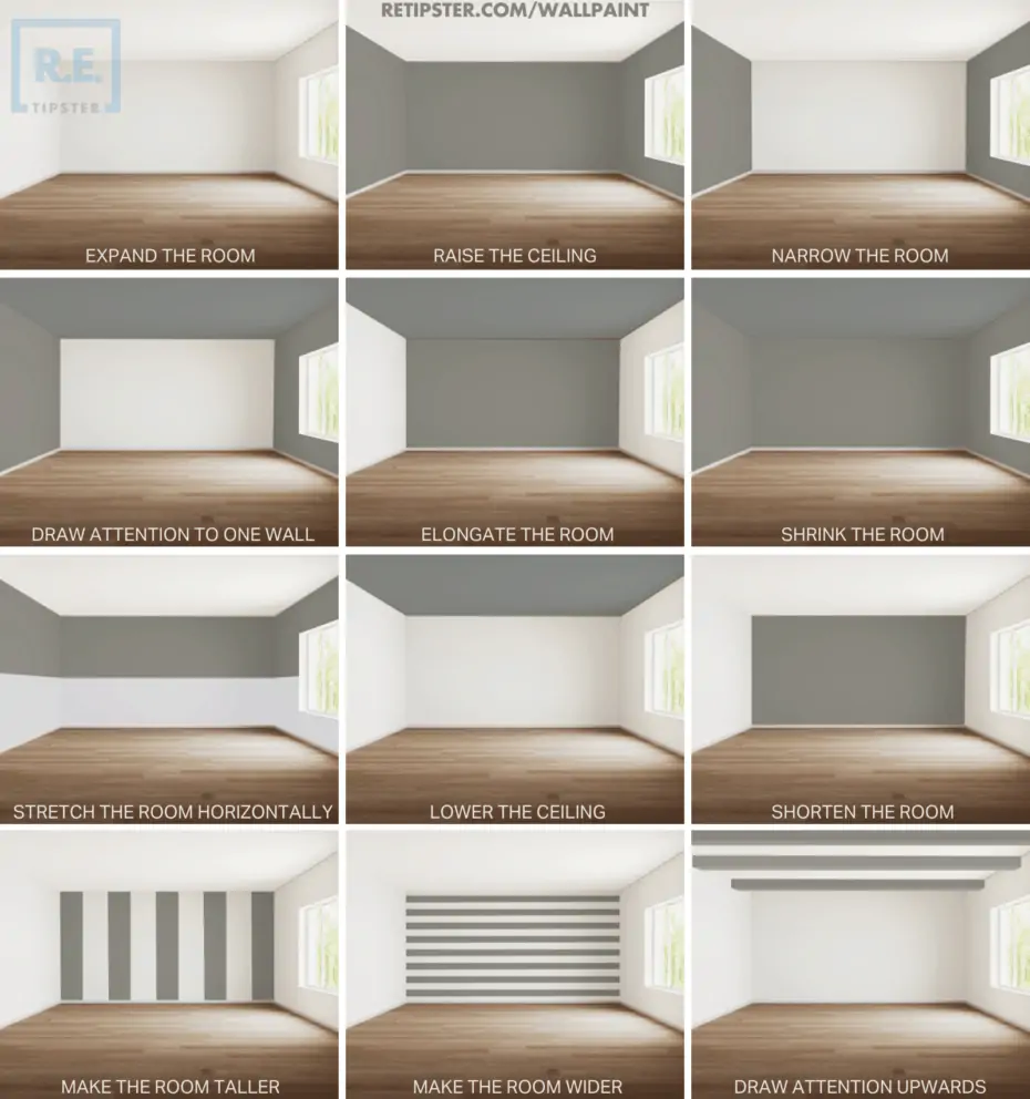
Am I dumb if these all just kinda look the same to me lol
The difference was more clear before this image was reposted to hell and back and got all blurry
Light interacts with colors and paint and will refract more or less accordingly. Because our eyes work through light capture, that's how this concept works for us.
I might wage that unless you're in said room it will be harder to realize this effect.
I would also say that this only effects perception and I guess a windowless room will need a lot of artificial light (just a guess though).
Pretty much look the same to me too, wonder if it is different in person.
I don't think I would have known what each one was attempting to show without the explanation.
The one that says “shortening” actually looks longer to me - like a long tunnel going off into the dark.
Same here. The "stretching the space vertically" looks like it's elongated it horizontally to me.
Maybe it depends on whether you think walls should be lighter colored or bot?
"How to use the bottom of that dark grey paint tin you've had in the cellar for ages"
1. Defining a Guide Guides are comprehensive reference materials, how-tos, or comparison tables. A guide must be well-organized both in content and layout. Information should be easily accessible without unnecessary navigation. Guides can include flowcharts, step-by-step instructions, or visual references that compare different elements side by side.
2. Infographic Guidelines Infographics are permitted if they are educational and informative. They should aim to convey complex information visually and clearly. However, infographics that primarily serve as visual essays without structured guidance will be subject to removal.
3. Grey Area Moderators may use discretion when deciding to remove posts. If in doubt, message us or use downvotes for content you find inappropriate.
4. Source Attribution If you know the original source of a guide, share it in the comments to credit the creators.
5. Diverse Content To keep our community engaging, avoid saturating the feed with similar topics. Excessive posts on a single topic may be moderated to maintain diversity.
6. Verify in Comments Always check the comments for additional insights or corrections. Moderators rely on community expertise for accuracy.
Direct Image Links Only Only direct links to .png, .jpg, and .jpeg image formats are permitted.
Educational Infographics Only Infographics must aim to educate and inform with structured content. Purely narrative or non-informative infographics may be removed.
Serious Guides Only Nonserious or comedy-based guides will be removed.
No Harmful Content Guides promoting dangerous or harmful activities/materials will be removed. This includes content intended to cause harm to others.
By following these rules, we can maintain a diverse and informative community. If you have any questions or concerns, feel free to reach out to the moderators. Thank you for contributing responsibly!